
Features Component
Showcase component for highlighting key product features. Displays features in a responsive grid with icons, titles, and descriptions.
Overview
The Features component creates an engaging features section that showcases your product's key capabilities. It's designed to communicate value propositions clearly and convert visitors into users.
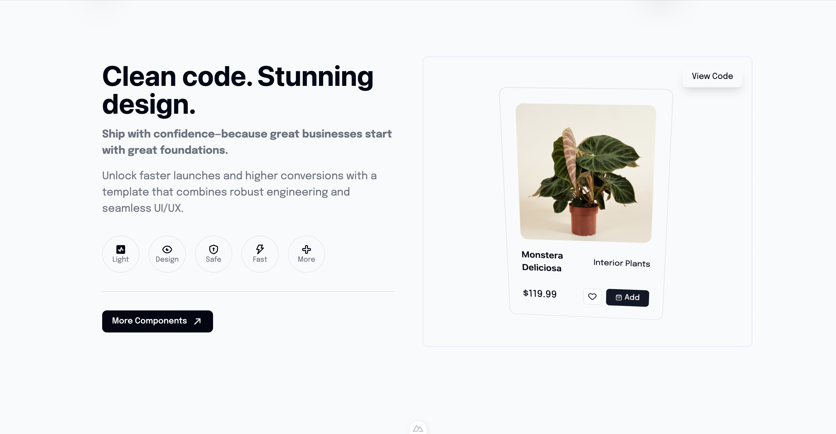
Preview
Basic Usage
vue
<template>
  <section id="features">
    <Features />
  </section>
</template>

<script setup lang="ts">
import Features from '@/components/Features.vue'
</script>Features
- Responsive Grid - Adapts from 1 to 3 columns based on screen size
- Icon Integration - Uses icon library for visual consistency
- Animation Support - Scroll-triggered animations
- Internationalization - Full i18n support
- Customizable Layout - Easy to modify feature list
Component Structure
vue
<template>
  <div class="features-section">
    <!-- Section Header -->
    <div class="text-center mb-12">
      <h2>{{ $t('features.title') }}</h2>
      <p>{{ $t('features.subtitle') }}</p>
    </div>

    <!-- Features Grid -->
    <div class="grid md:grid-cols-2 lg:grid-cols-3 gap-8">
      <div v-for="feature in features" :key="feature.id" class="feature-card">
        <Icon :name="feature.icon" />
        <h3>{{ feature.title }}</h3>
        <p>{{ feature.description }}</p>
      </div>
    </div>
  </div>
</template>Default Features
The component typically includes features like:
- Authentication - Secure user management
- Payment Processing - Stripe integration
- Email System - Transactional emails
- Database - Supabase integration
- UI Components - Pre-built components
- SEO Ready - Optimized for search engines
Internationalization
Configure feature content in your i18n files:
json
{
  "features": {
    "title": "Powerful Features",
    "subtitle": "Everything you need to build your SaaS",
    "auth": {
      "title": "Authentication",
      "description": "Secure user management with OAuth and magic links"
    },
    "payments": {
      "title": "Payments",
      "description": "Stripe integration with subscriptions and invoices"
    }
  }
}Customization
Adding New Features
typescript
const features = [
  {
    id: 'custom-feature',
    icon: 'heroicons:star',
    title: 'Custom Feature',
    description: 'Your custom feature description'
  }
]Changing Layout
Modify the grid classes to change the layout:
vue
<!-- 4 columns on large screens -->
<div class="grid md:grid-cols-2 lg:grid-cols-4 gap-6">Animation
The component supports scroll-triggered animations using libraries like AOS or custom intersection observers.
Related Components
- HeroComponent - Main hero section
- Pricing - Pricing section
- Testimonials - Customer testimonials