
Toast Component
A notification system for displaying temporary messages to users. Features multiple variants, auto-dismiss functionality, progress indicators, and smooth animations.
Overview
The Toast component provides user feedback through non-intrusive notifications that appear temporarily on screen. It includes success, error, warning, and info variants with customizable duration and auto-close behavior.
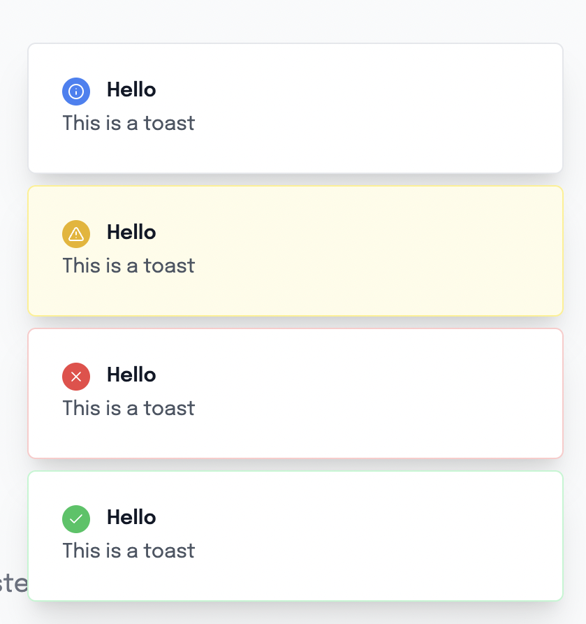
Preview
Basic Usage
Using the Composable (Recommended)
<template>
  <div>
    <Button @click="showSuccess">Show Success</Button>
    <Button @click="showError">Show Error</Button>
    <Button @click="showWarning">Show Warning</Button>
    <Button @click="showInfo">Show Info</Button>

    <!-- Toast container (place once in your app) -->
    <ToastContainer />
  </div>
</template>

<script setup lang="ts">
import { useToast } from '@/composables/useToasts'

const { toast } = useToast()

const showSuccess = () => {
  toast.success('Success!', 'Your action was completed successfully.')
}

const showError = () => {
  toast.error('Error occurred', 'Something went wrong. Please try again.')
}

const showWarning = () => {
  toast.warning('Warning', 'Please check your input.')
}

const showInfo = () => {
  toast.info('Information', 'Here is some useful information.')
}
</script>Direct Component Usage
<template>
  <Toast
    v-if="showToast"
    title="Success!"
    description="Your action was completed."
    variant="success"
    :duration="3000"
    @close="showToast = false"
  />
</template>

<script setup lang="ts">
const showToast = ref(true)
</script>Component API
Props
| Prop | Type | Default | Description |
|---|---|---|---|
title | string | undefined | Toast title text |
description | string | undefined | Toast description text |
variant | 'default' | 'success' | 'error' | 'warning' | 'info' | 'default' | Visual style variant |
duration | number | 5000 | Auto-close duration in milliseconds |
autoClose | boolean | true | Whether to auto-close the toast |
Events
| Event | Payload | Description |
|---|---|---|
close | void | Emitted when toast is closed |
Slots
This component doesn't use slots. Content is provided through props.
Variants
Success
Green styling for successful operations.
toast.success('Account created', 'Welcome to ClawPlate!')Error
Red styling for error messages and failures.
toast.error('Login failed', 'Invalid email or password.')Warning
Yellow styling for warnings and cautions.
toast.warning('Unsaved changes', 'You have unsaved changes that will be lost.')Info
Blue styling for informational messages.
toast.info('New feature', 'Check out our new dashboard widgets!')Default
Gray styling for general notifications.
toast({ title: 'Update available', variant: 'default' })Features
🚀 Auto-dismiss
Toasts automatically disappear after the specified duration.
<Toast
  title="Auto-close in 3 seconds"
  :duration="3000"
  :autoClose="true"
/>📊 Progress Indicator
Visual progress bar shows remaining time when auto-close is enabled.
❌ Manual Dismiss
Users can manually close toasts using the close button.
🎨 Smooth Animations
Slide-in and fade-out animations for smooth user experience.
🎯 Icon Integration
Each variant includes appropriate icons automatically.
Composable API
useToast()
The main composable for managing toasts globally.
const { toast, setToastContainer } = useToast()

// Variant shortcuts
toast.success(title, description?)
toast.error(title, description?)
toast.warning(title, description?)
toast.info(title, description?)

// Custom options
toast({
  title: 'Custom Toast',
  description: 'With custom settings',
  variant: 'success',
  duration: 10000,
  autoClose: false
})ToastContainer Setup
Place the ToastContainer component once in your app:
<!-- In your main layout or app.vue -->
<template>
  <div>
    <!-- Your app content -->

    <!-- Toast container (required) -->
    <ToastContainer />
  </div>
</template>Advanced Examples
Form Validation
<template>
  <form @submit.prevent="handleSubmit">
    <input v-model="email" type="email" required />
    <Button type="submit">Submit</Button>
  </form>
</template>

<script setup lang="ts">
const { toast } = useToast()
const email = ref('')

const handleSubmit = async () => {
  try {
    await submitForm(email.value)
    toast.success('Form submitted', 'We will contact you soon!')
  } catch (error) {
    toast.error('Submission failed', 'Please check your input and try again.')
  }
}
</script>API Error Handling
<script setup lang="ts">
const { toast } = useToast()

const fetchData = async () => {
  try {
    const response = await $fetch('/api/data')
    toast.success('Data loaded successfully')
    return response
  } catch (error) {
    if (error.statusCode === 401) {
      toast.error('Authentication required', 'Please log in to continue.')
    } else if (error.statusCode === 500) {
      toast.error('Server error', 'Please try again later.')
    } else {
      toast.error('Something went wrong', error.message)
    }
  }
}
</script>Confirmation Actions
<script setup lang="ts">
const { toast } = useToast()

const deleteItem = async (id: string) => {
  try {
    await $fetch(`/api/items/${id}`, { method: 'DELETE' })
    toast.success('Item deleted', 'The item has been removed successfully.')
  } catch (error) {
    toast.error('Delete failed', 'Could not delete the item. Please try again.')
  }
}

const copyToClipboard = (text: string) => {
  navigator.clipboard.writeText(text)
  toast.info('Copied!', 'Text copied to clipboard.')
}
</script>Styling Details
Variant Styling
Each variant has specific background and border colors:
const toastVariants = {
  default: 'border-gray-200 bg-white',
  success: 'border-green-200 bg-green-50',
  error: 'border-red-200 bg-red-50',
  warning: 'border-yellow-200 bg-yellow-50',
  info: 'border-blue-200 bg-blue-50'
}Icon Colors
Icons are colored to match their variants:
const iconClasses = {
  default: 'bg-gray-500',
  success: 'bg-green-500',
  error: 'bg-red-500',
  warning: 'bg-yellow-500',
  info: 'bg-blue-500'
}Animation Classes
Custom CSS animations for smooth transitions:
.animate-in {
  animation: slideIn 0.3s ease-out;
}

.animate-out {
  animation: slideOut 0.3s ease-in;
}Accessibility
Keyboard Support
- Escape Key - Closes the focused toast
- Tab Navigation - Focus management for close button
Screen Reader Support
- Role - Proper ARIA roles for notifications
- Live Regions - Announces toast content to screen readers
<div
  role="alert"
  aria-live="polite"
  aria-atomic="true"
>
  <!-- Toast content -->
</div>Performance
Automatic Cleanup
- Timers and intervals are properly cleaned up
- Memory leaks are prevented through proper lifecycle management
Efficient Rendering
- Conditional rendering based on visibility state
- Optimized re-renders with computed properties
TypeScript Support
Full TypeScript integration with proper interfaces:
interface ToastOptions {
  title?: string
  description?: string
  variant?: 'default' | 'success' | 'error' | 'warning' | 'info'
  duration?: number
  autoClose?: boolean
}

interface ToastItem extends ToastOptions {
  id: string
}Dependencies
- Lucide Icons - For variant icons
- Vue 3 - Composition API
- Tailwind CSS - For styling
Related Components
- Button - For triggering toast notifications
- AlertModal - For persistent alerts
- GlobalModal - For modal confirmations
Migration Guide
From Basic Alerts
Replace browser alerts with toast notifications:
// Before
alert('Success!')

// After
toast.success('Success!', 'Your action was completed.')From Console Logs
Replace debug logs with user-visible feedback:
// Before
console.log('Form submitted')

// After
toast.info('Form submitted', 'We will process your request.')