
Footer Component
Site footer component with links, branding, and social media integration.
Overview
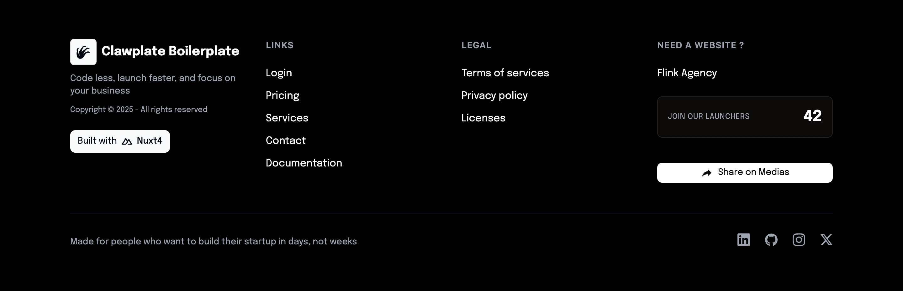
The Footer component provides the bottom section of your site with essential links, legal information, and branding elements. It includes responsive design and dark mode support.
Preview
Basic Usage
vue
<template>
  <div>
    <!-- Your page content -->
    <Footer />
  </div>
</template>

<script setup lang="ts">
import Footer from '@/components/Footer.vue'
</script>Features
- Responsive Design - Adapts to all screen sizes
- Link Organization - Structured link categories
- Social Media Icons - Integrated social links
- Copyright Information - Automatic year updates
- Dark Mode Support - Consistent with site theme
Component API
Props
This component typically doesn't accept props. Configuration is handled through global settings.
Slots
default- Custom footer contentsocial- Social media iconslegal- Legal links section
Customization
Update footer links and branding in the component template to match your brand and requirements.
Related Components
- Header - Main navigation
- SwitchLanguage - Language switching