
AlertModal Component
Alert modal component for displaying important messages, confirmations, and notifications. Provides a clean, accessible modal interface with customizable actions.
Overview
The AlertModal component creates modal dialogs for important user interactions like confirmations, warnings, and informational messages. It includes proper focus management, keyboard navigation, and customizable action buttons.
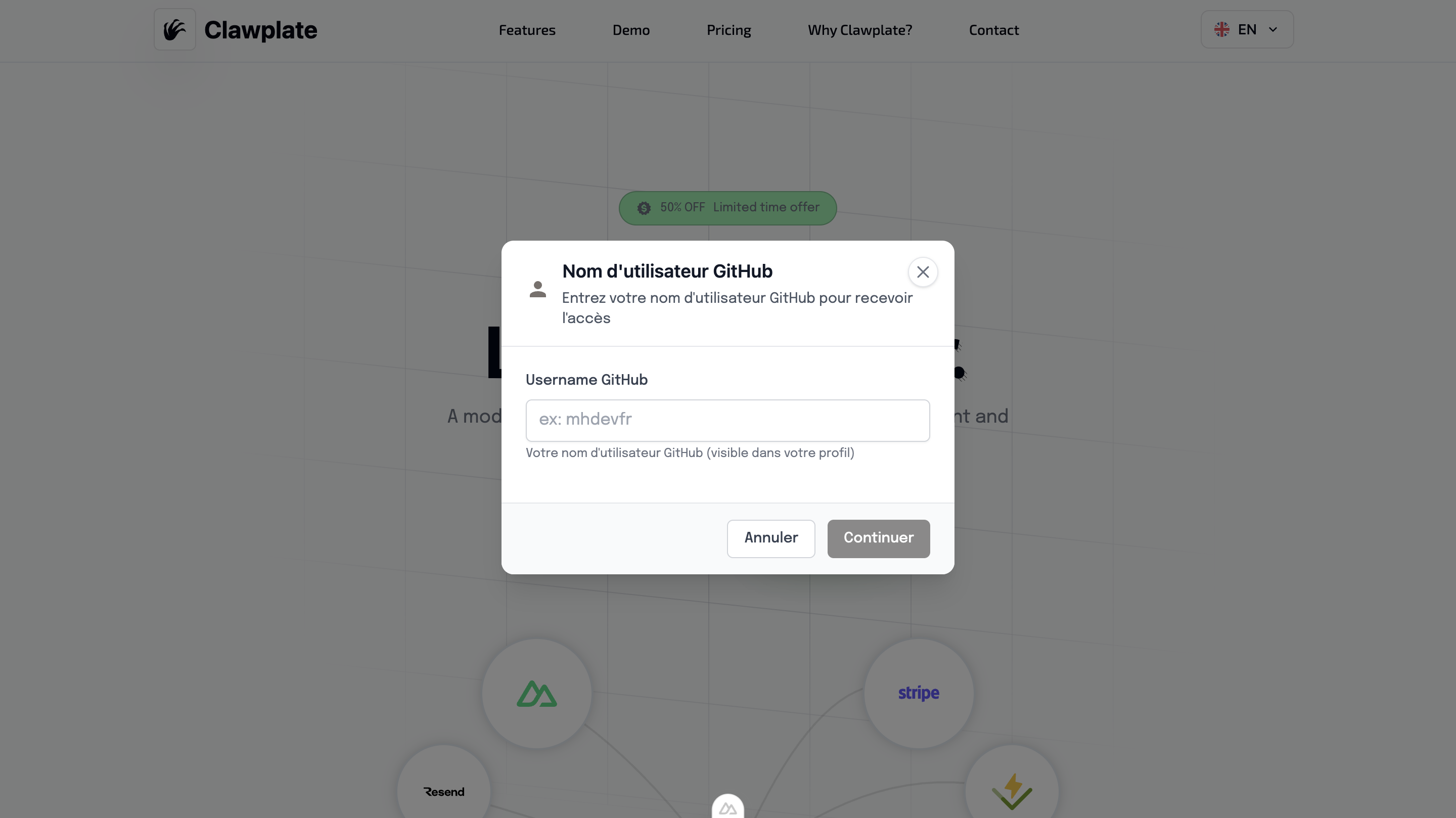
Preview
Basic Usage
vue
<template>
  <div>
    <Button @click="showAlert = true">Show Alert</Button>

    <AlertModal
      v-model="showAlert"
      title="Confirm Action"
      message="Are you sure you want to delete this item?"
      type="warning"
      @confirm="handleConfirm"
      @cancel="handleCancel"
    />
  </div>
</template>

<script setup lang="ts">
const showAlert = ref(false)

const handleConfirm = () => {
  // Handle confirmation
  showAlert.value = false
}

const handleCancel = () => {
  // Handle cancellation
  showAlert.value = false
}
</script>Features
🎯 Multiple Alert Types
- Info - Informational messages
- Success - Success confirmations
- Warning - Warning messages
- Error - Error notifications
🔘 Customizable Actions
- Primary and secondary buttons
- Custom button labels
- Configurable button variants
- Action callbacks
♿ Accessibility Features
- Focus trap management
- Keyboard navigation (Enter/Escape)
- ARIA labels and roles
- Screen reader support
🎨 Modern Design
- Clean modal overlay
- Responsive design
- Smooth animations
- Icon integration
Component API
Props
| Prop | Type | Default | Description |
|---|---|---|---|
modelValue | boolean | false | Modal visibility state |
title | string | '' | Modal title |
message | string | '' | Modal message content |
type | 'info' | 'success' | 'warning' | 'error' | 'info' | Alert type |
confirmText | string | 'Confirm' | Confirm button text |
cancelText | string | 'Cancel' | Cancel button text |
showCancel | boolean | true | Show cancel button |
Events
| Event | Payload | Description |
|---|---|---|
update:modelValue | boolean | Modal visibility change |
confirm | void | Confirm button clicked |
cancel | void | Cancel button clicked |
close | void | Modal closed (any method) |
Alert Types
Info Alert
vue
<AlertModal
  type="info"
  title="Information"
  message="Here's some important information for you."
/>Success Alert
vue
<AlertModal
  type="success"
  title="Success!"
  message="Your action was completed successfully."
/>Warning Alert
vue
<AlertModal
  type="warning"
  title="Warning"
  message="This action cannot be undone. Continue?"
/>Error Alert
vue
<AlertModal
  type="error"
  title="Error"
  message="Something went wrong. Please try again."
/>Advanced Examples
Custom Actions
vue
<AlertModal
  v-model="showCustomAlert"
  title="Custom Actions"
  message="Choose your action:"
  confirm-text="Save Changes"
  cancel-text="Discard"
  @confirm="saveChanges"
  @cancel="discardChanges"
/>Single Action Modal
vue
<AlertModal
  v-model="showInfoModal"
  title="Information"
  message="This is an informational message."
  :show-cancel="false"
  confirm-text="Got it"
  @confirm="acknowledgeInfo"
/>With Custom Content
vue
<AlertModal v-model="showModal" title="Custom Content">
  <template #content>
    <div class="custom-content">
      <p>Your custom HTML content goes here.</p>
      <ul>
        <li>Item 1</li>
        <li>Item 2</li>
        <li>Item 3</li>
      </ul>
    </div>
  </template>
</AlertModal>Styling Details
Modal Structure
- Overlay with backdrop blur
- Centered modal container
- Responsive width and padding
- Smooth fade animations
Type-specific Styling
Each alert type has distinct visual styling:
- Info: Blue accent colors
- Success: Green accent colors
- Warning: Yellow/orange accent colors
- Error: Red accent colors
Keyboard Navigation
- Enter: Confirm action
- Escape: Cancel/close modal
- Tab: Navigate between buttons
- Space: Activate focused button
Integration Examples
With Form Validation
vue
<script setup lang="ts">
const showValidationAlert = ref(false)
const validationErrors = ref([])

const validateForm = () => {
  if (errors.length > 0) {
    validationErrors.value = errors
    showValidationAlert.value = true
  }
}
</script>

<template>
  <AlertModal
    v-model="showValidationAlert"
    type="error"
    title="Validation Errors"
    :message="`Please fix ${validationErrors.length} errors before continuing.`"
    :show-cancel="false"
    confirm-text="OK"
  />
</template>With API Operations
vue
<script setup lang="ts">
const deleteItem = async (itemId) => {
  const confirmed = await showConfirmation({
    title: 'Delete Item',
    message: 'This action cannot be undone.',
    type: 'warning'
  })

  if (confirmed) {
    try {
      await $fetch(`/api/items/${itemId}`, { method: 'DELETE' })
      toast.success('Item deleted successfully')
    } catch (error) {
      showError('Failed to delete item')
    }
  }
}
</script>Related Components
- GlobalModal - General modal system
- Toast - Non-blocking notifications
- Button - Modal action buttons