
UserDropDown (Component)
Description
The UserDropDown component is a modern and elegant dropdown menu designed to display user information and provide quick access to main actions. It integrates perfectly into a navbar or application header.
Preview
*Modern dropdown menu with user avatar, name display, and customizable menu items*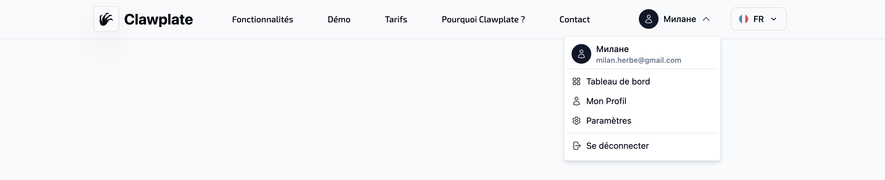
Features
- 🎨 Modern design with smooth animations
- 👤 User display with avatar and information
- 🔧 Customizable menu with default items
- 📱 Responsive with mobile adaptation
- ⚡ Composable API for easy integration
- 🎯 Accessibility with focus and keyboard navigation
Usage
Import
vue
<template>
  <UserDropDown
    :user="currentUser"
    :menu-items="customMenuItems"
  />
</template>Props
| Prop | Type | Default | Description |
|---|---|---|---|
user | Object | null | null | User object with metadata |
menuItems | DropdownItem[] | [] | List of menu items |
User Object Structure
typescript
interface User {
  email: string
  user_metadata: {
    full_name?: string
    avatar_url?: string
  }
}DropdownItem Structure
typescript
interface DropdownItem {
  id: string
  label: string
  icon?: string
  href?: string
  action?: () => void
  divider?: boolean
  disabled?: boolean
}Examples
Basic Usage
vue
<template>
  <UserDropDown />
</template>With Custom User
vue
<template>
  <UserDropDown
    :user="{
      email: 'john@example.com',
      user_metadata: {
        full_name: 'John Doe',
        avatar_url: 'https://example.com/avatar.jpg'
      }
    }"
  />
</template>Custom Menu
vue
<template>
  <UserDropDown
    :menu-items="customMenuItems"
  />
</template>

<script setup>
const customMenuItems = [
  {
    id: 'dashboard',
    label: 'Dashboard',
    icon: 'heroicons:squares-2x2',
    href: '/dashboard'
  },
  {
    id: 'projects',
    label: 'My Projects',
    icon: 'heroicons:folder',
    href: '/projects'
  },
  {
    id: 'divider-1',
    divider: true
  },
  {
    id: 'settings',
    label: 'Settings',
    icon: 'heroicons:cog-6-tooth',
    href: '/settings'
  },
  {
    id: 'logout',
    label: 'Sign Out',
    icon: 'heroicons:arrow-right-on-rectangle',
    action: () => {
      // Logout logic
      console.log('Signing out...')
    }
  }
]
</script>Navbar Integration
vue
<template>
  <nav class="flex items-center justify-between p-4 bg-white shadow-sm">
    <div class="flex items-center space-x-4">
      <Logo />
      <NavigationMenu />
    </div>

    <div class="flex items-center space-x-4">
      <NotificationBell />
      <UserDropDown />
    </div>
  </nav>
</template>Composable API
The component uses the useDropdown composable to manage the menu state:
typescript
const { isOpen, dropdownRef, toggle, close } = useDropdown()Available Methods
toggle(): Opens/closes the menuclose(): Closes the menuisOpen: Reactive opening state
Default Menu
If no menuItems are provided, the component uses a default menu:
typescript
const defaultMenuItems = [
  {
    id: 'profile',
    label: 'My Profile',
    icon: 'heroicons:user',
    href: '/profile'
  },
  {
    id: 'settings',
    label: 'Settings',
    icon: 'heroicons:cog-6-tooth',
    href: '/settings'
  },
  {
    id: 'divider-1',
    divider: true
  },
  {
    id: 'logout',
    label: 'Sign Out',
    icon: 'heroicons:arrow-right-on-rectangle',
    action: () => {}
  }
]Styles and Themes
The component uses Tailwind CSS classes and automatically adapts to the application theme:
Main Classes
bg-popover: Menu backgroundtext-popover-foreground: Text colorborder: Menu bordershadow-md: Drop shadowbg-primary: Avatar colortext-primary-foreground: Avatar text color
Responsive
- User name is hidden on mobile (
hidden md:block) - Menu adapts to screen width
- Automatic positioning to avoid overflow
Animations
The component includes smooth animations:
- Entry : Scale + fade + translate
- Exit : Scale + fade + reverse translate
- Chevron icon : 180° rotation on opening
Accessibility
- Keyboard focus support
- Navigation with Tab/Shift+Tab
- Close with Escape
- Close by clicking outside
- Appropriate ARIA attributes
Supabase Integration
The component automatically integrates with Supabase Auth:
vue
<script setup>
// Automatic retrieval of connected user
const user = computed(() => {
  return props.user || useSupabaseUser().value
})
</script>Advanced Customization
Custom Styles
vue
<template>
  <UserDropDown
    class="custom-user-dropdown"
    :menu-items="menuItems"
  />
</template>

<style>
.custom-user-dropdown {
  /* Custom styles */
}
</style>Custom Actions
vue
<script setup>
const handleLogout = async () => {
  const supabase = useSupabaseClient()
  await supabase.auth.signOut()
  await navigateTo('/login')
}

const menuItems = [
  // ... other items
  {
    id: 'logout',
    label: 'Sign Out',
    icon: 'heroicons:arrow-right-on-rectangle',
    action: handleLogout
  }
]
</script>Best Practices
- Always provide a fallback for non-connected users
- Use consistent icons with the design system
- Group actions with logical separators
- Test accessibility with keyboard navigation
- Optimize performance by avoiding unnecessary re-renders
Troubleshooting
Menu doesn't open
- Check that the
useDropdowncomposable is properly imported - Ensure the
@clickevent is properly attached
Styles don't apply
- Verify that Tailwind CSS is configured
- Make sure custom CSS classes are defined
User doesn't appear
- Check the
userobject structure - Ensure Supabase Auth is configured
Complete Example
vue
<template>
  <div class="min-h-screen bg-gray-50">
    <header class="bg-white shadow-sm">
      <div class="max-w-7xl mx-auto px-4 sm:px-6 lg:px-8">
        <div class="flex justify-between items-center h-16">
          <div class="flex items-center">
            <h1 class="text-xl font-bold">My App</h1>
          </div>

          <div class="flex items-center space-x-4">
            <button class="p-2 text-gray-400 hover:text-gray-500">
              <Icon name="heroicons:bell" class="w-5 h-5" />
            </button>

            <UserDropDown
              :menu-items="userMenuItems"
            />
          </div>
        </div>
      </div>
    </header>

    <main class="max-w-7xl mx-auto py-6 sm:px-6 lg:px-8">
      <!-- Main content -->
    </main>
  </div>
</template>

<script setup>
const userMenuItems = [
  {
    id: 'profile',
    label: 'My Profile',
    icon: 'heroicons:user',
    href: '/profile'
  },
  {
    id: 'settings',
    label: 'Settings',
    icon: 'heroicons:cog-6-tooth',
    href: '/settings'
  },
  {
    id: 'billing',
    label: 'Billing',
    icon: 'heroicons:credit-card',
    href: '/billing'
  },
  {
    id: 'divider-1',
    divider: true
  },
  {
    id: 'help',
    label: 'Help',
    icon: 'heroicons:question-mark-circle',
    href: '/help'
  },
  {
    id: 'logout',
    label: 'Sign Out',
    icon: 'heroicons:arrow-right-on-rectangle',
    action: async () => {
      const supabase = useSupabaseClient()
      await supabase.auth.signOut()
      await navigateTo('/login')
    }
  }
]
</script>This component is part of the ClawPlate suite and is optimized for modern SaaS applications.